Corporate video has a strict brief. People need to look professional, the logo has to stay the exact brand color, and the result should feel modern without drawing attention to itself. These free corporate video LUTs give office and interview footage a polished look, and the notes below cover what clients tend to check first.
Updated November 2026 · 4 free picks for interviews, products and brand films


The Cinematic LUT at 40 to 60% adds depth to interviews without making them look like a movie trailer. It's subtle enough for almost any brand, which makes it the safe default.
Software companies, hardware launches and startups often want a clean, cool look. The Vivid Teal LUT makes glass, screens and white desks look crisp. Keep it off people-heavy scenes so skin stays warm.
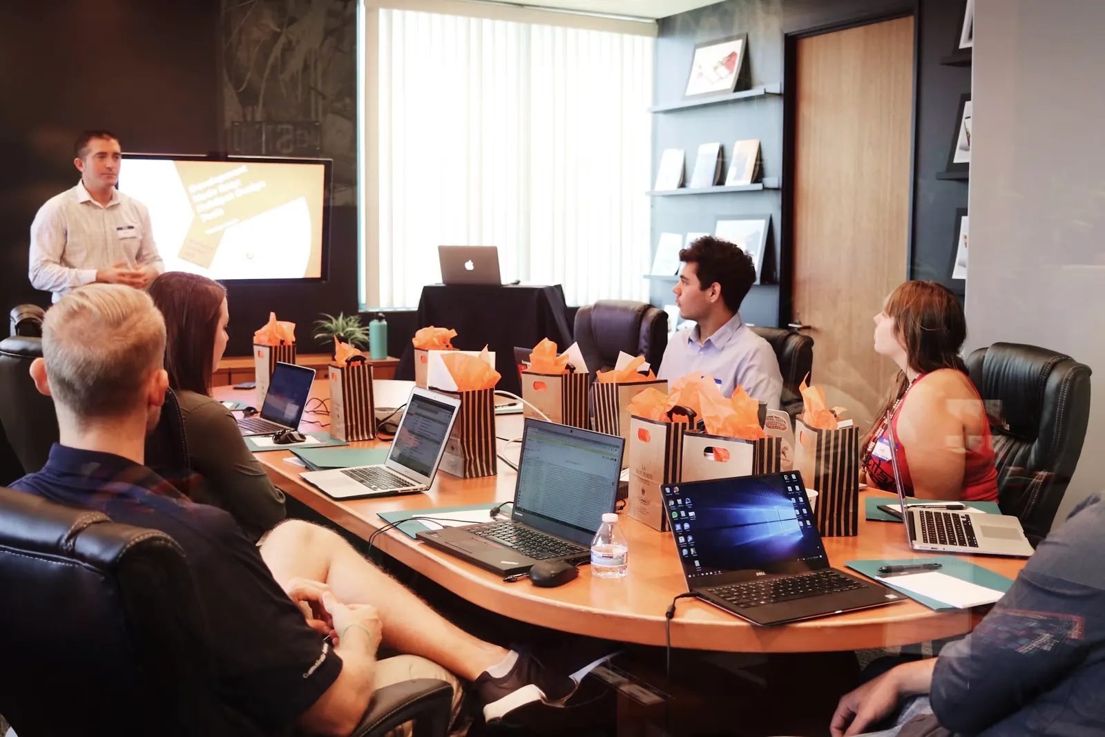
Recruiting videos, team days and behind-the-scenes content should feel friendly. The Warm LUT at low strength makes an office feel like a place people enjoy working.
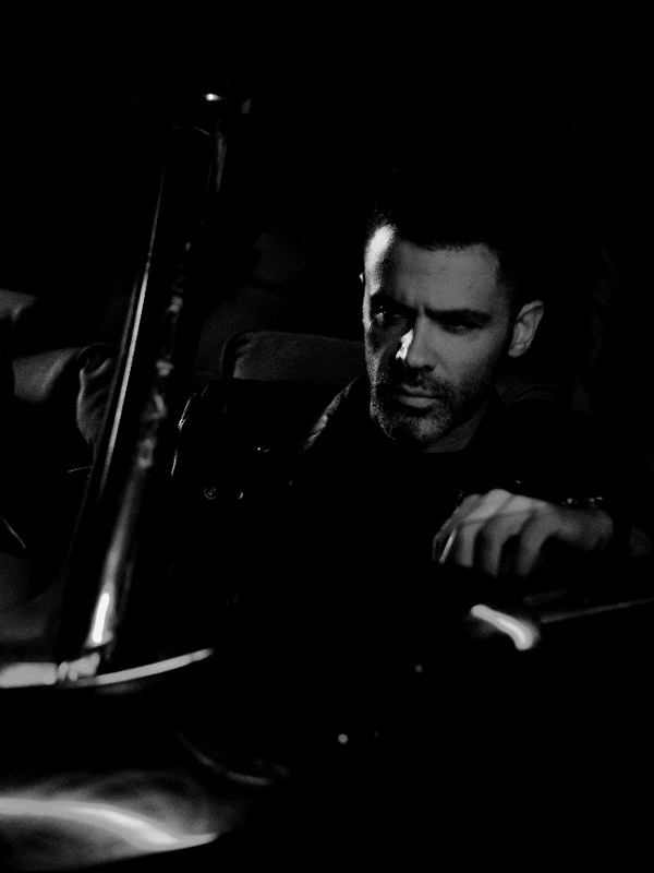
A founder telling the company's story can look striking in monochrome, especially intercut with color product shots. Use the Black & White LUT for a few moments so it feels special.

These carry the message, so the speaker comes first. Keep skin natural and the background slightly darker than the face, and use the same look across every interviewee.
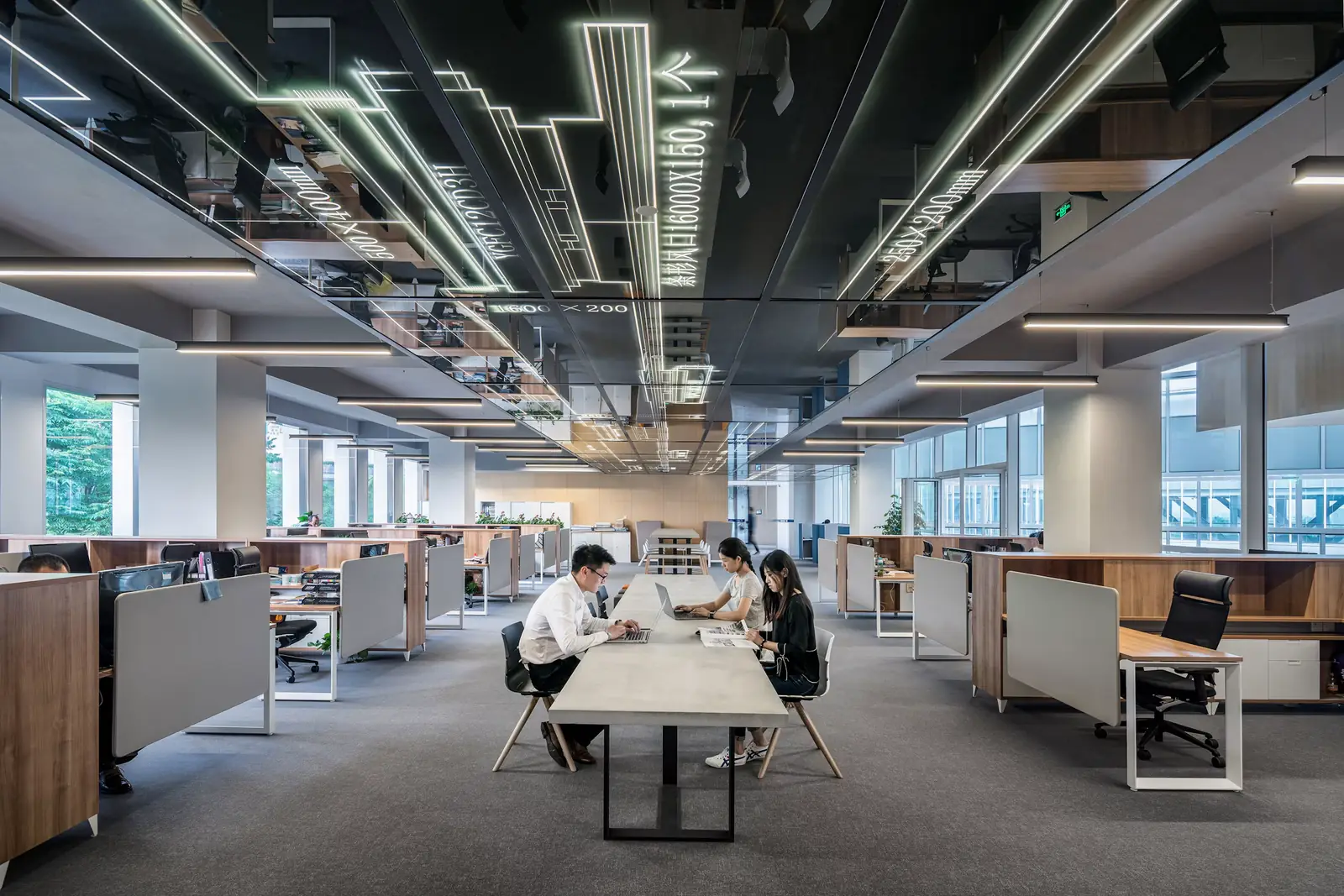
Offices usually mix daylight with cool LED panels. Correct for a neutral white wall before the LUT, then use Warm or Cinematic depending on how friendly the brand wants to feel.
Product color has to be accurate, since customers will see the real thing. Grade lightly, and check the product against the actual item or the brand's reference photos.
Stages mix colored lights, projectors and dark rooms. Correct the speakers' faces first and accept that the background will vary. Cinematic holds event footage together well, and the music video guide has more on colored stage light.
Never put a LUT on screen recordings, logos or animated graphics. Keep them on their own layer above the adjustment layer, so brand colors stay exact.

Get the brand colors and any rules about how people should look before you shoot. If the brand blue is sacred, you'll know to keep cool looks away from the logo.
Fluorescent and cheap LED panels can add a green cast. Set a custom white balance on a grey card, or turn the overheads off and light the interview yourself.
A key light, a little fill and some separation from the background matter more than any grade. A well-lit interview needs only a gentle LUT.
Two-camera interviews are standard. Set both cameras to the same white balance and picture profile, and film a color chart at the start of the day.

After the LUT, check every logo, uniform and product against the brand colors. If they've shifted, mask them out or move them above the look.
Corporate clients rarely want a strong style. A LUT at 30 to 50% looks polished without making anyone ask what happened to the colors.
The CEO will watch the video more carefully than anyone. Check their skin in every shot, and soften harsh contrast on their face.
Companies often make several videos a year. Save your grade as a preset so next quarter's video matches this one.
Most corporate video ends up on LinkedIn, the website or a big screen at an event. Check the export on a laptop, a phone and a TV if you can.
Brand work needs looks that feel polished and safe. The Commercial and Studio categories in the Master Grade Collection are built for clean, professional footage, with Skin Tone looks that keep people natural, and HDR grades for products. They're all .cube files, ready for client projects.
The free Cinematic LUT at 40 to 60% suits most interviews and brand films. Use Vivid Teal for tech and product work, and Warm for culture and recruiting videos.
Keep logos, graphics and screen recordings above the adjustment layer that holds the LUT, and check products and uniforms against the brand guide after grading.
Yes. Paid work for brands and agencies is fine. The looks are cleared for full commercial use.
Usually 30 to 50%. Corporate work should look polished and professional, and a strong style can distract from the message.
Add an adjustment layer above your footage and load the .cube in Lumetri Color under Creative, then Look, with Intensity around 30 to 50. Keep logos, lower thirds and screen recordings on tracks above that layer so the LUT never touches them.
Set a custom white balance on a grey card when you shoot. In the edit, correct the green cast before the LUT, using a white wall as your reference.
Slightly warm usually makes people look friendlier and healthier. Cooler looks suit tech brands, but keep skin warm even when the rest of the image is cool.

Professional .cube files. Free, no credit card. Browse every style: