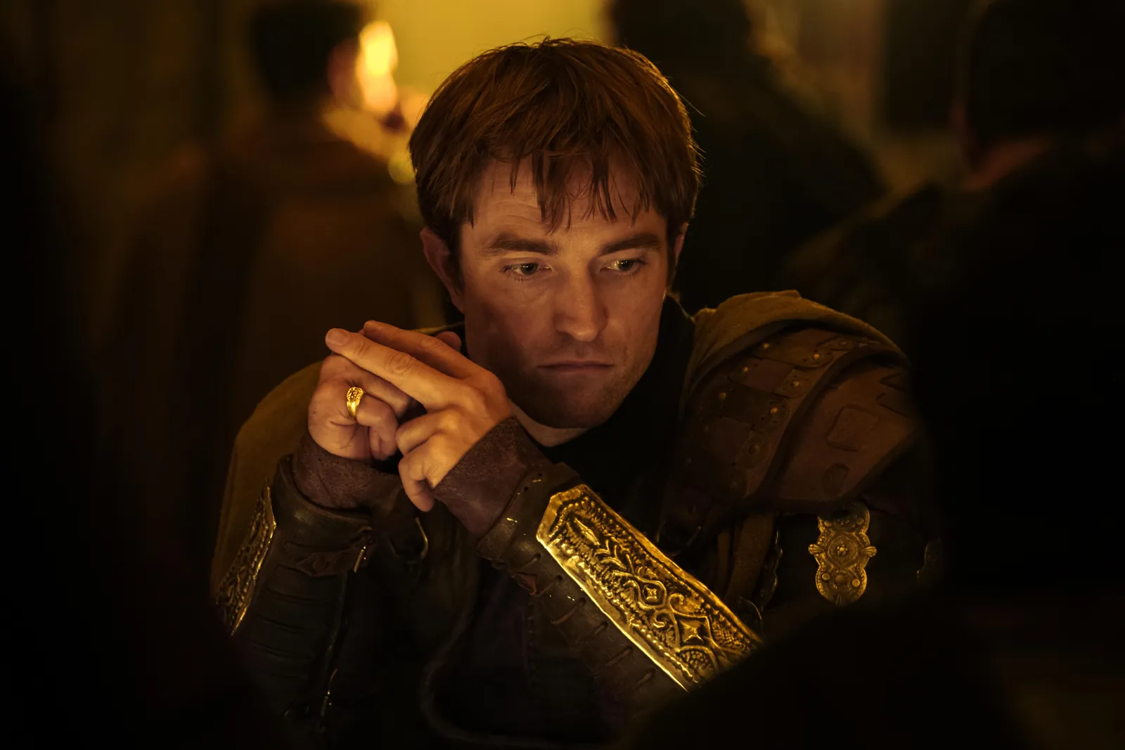
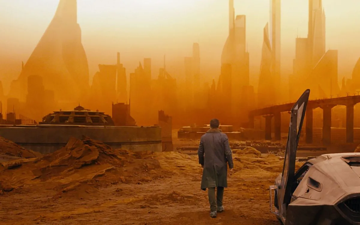
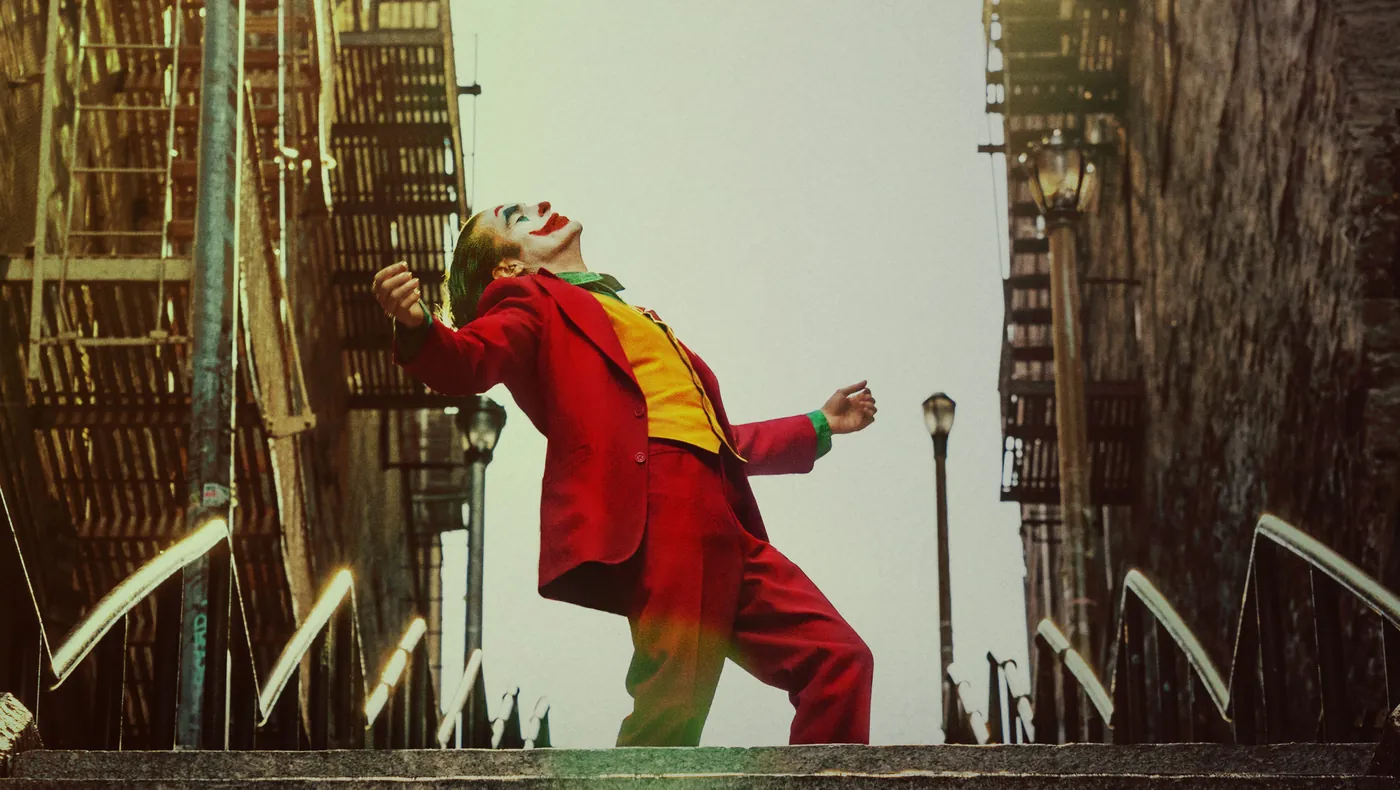
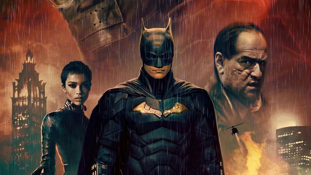
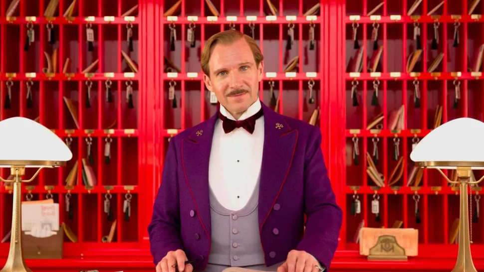
How some of the most recognizable films of the last decade were color graded, from the desert palette of Dune to the pink pastels of The Grand Budapest Hotel. Each guide breaks down the director, cinematographer and colorist behind the look, the color palette, and how to get close to it on your own footage with a free LUT.
Updated November 2026 · 5 film breakdowns · Works with Premiere Pro, DaVinci Resolve, Final Cut Pro and CapCut

Search for a famous film's color grade and you mostly find paid LUT packs that promise to copy a movie in one click. They rarely explain why the film looks the way it does. These guides start from the film itself: who directed and shot it, which camera and process were used, and how the colorist shaped the final image.
Each breakdown then shows the closest free starting point from our library, a step-by-step recipe to push it toward the film's palette, and the shooting choices that matter more than any LUT. The goal is for you to understand each look well enough to adapt it to your own footage.
Pick the film whose mood is closest to what you are making. Every guide links to a free LUT you can download without an email.
Most cinematic color grading comes back to a handful of looks that films have been refining for decades. Once you can recognize them, it gets much easier to decide what your own footage needs. Here are the ones you'll see again and again, with the free LUT that gets you closest to each.
Warm, orange-leaning skin against cool teal shadows. It took over Hollywood in the early digital era, with Michael Bay's Transformers as the loudest example and many Marvel films using a softer version. Start with the Teal & Orange LUT, or the Cinematic LUT if you want something quieter.
Muted color, heavy contrast and inky blacks. Labs originally got there by keeping extra silver in the film during processing, and thrillers like Se7en made it famous. The Moody Dark LUT is the closest free match, and our Batman breakdown shows a modern take on it.
Night scenes shot in daylight and pushed deep blue in the grade. It's an old trick that still works, from Truffaut to the night chase in Mad Max: Fury Road. Use the Moody Blue LUT and keep the sky out of your frame.
Low, amber sunlight that makes skin glow and backgrounds melt. Days of Heaven and La La Land both lean on it. The Golden Hour LUT is made for this, with Sunset for a bolder sky and Warm for something subtler. Our Dune guide shows how to dry it out into a desert look.
Soft pinks, mint and powder blue, usually built into the sets and costumes long before anyone touches a grade. Wes Anderson owns this one. Try the Pastel LUT and read the Grand Budapest Hotel breakdown for the details.
Modern films still choose monochrome when they want weight or a sense of history, from Schindler's List to Roma and parts of Oppenheimer. Contrast does all the work here, so the Black & White LUT builds in deep blacks.
Soft contrast, lifted shadows and slightly aged color that feels like a print from the 70s. Joker's grade was built on a custom LUT that imitates an old Kodak stock. Start with Vintage Film for a full period feel or Faded Film for a lighter matte, and see the Joker breakdown for the rest.
Film color grading gets most of the credit, but a movie look is usually decided long before the colorist sees a single frame. Every guide on this page follows the same chain of decisions, and it helps to know who makes them.
Before shooting, the director and director of photography agree on references and test cameras, lenses and film stocks. On Dune, Greig Fraser and Denis Villeneuve tested film against digital before settling on a hybrid of the two. Those early tests decide most of what you see on screen.
Production designers and costume designers choose the colors that appear in front of the lens. The pinks and purples of The Grand Budapest Hotel came from Adam Stockhausen's sets and Milena Canonero's costumes, and both won Academy Awards for them. No grade can add a color that was never there.
Roger Deakins is known for building a look with light on set, which is how the orange haze of Blade Runner 2049 was made. Hard or soft light, warm or cool sources, and how much darkness is left in the frame all shape the final image more than any preset.
In the digital intermediate, a colorist balances every shot and applies the final look, often through a custom show LUT designed for that film. Jill Bogdanowicz built Joker's, and Dave Cole graded both Dune and The Batman. That last stage is the part a LUT can help you imitate, so each of our guides pairs a free LUT with notes on lighting and shooting.
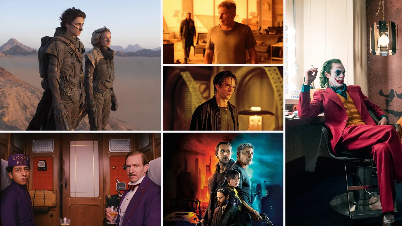
Color grading is the stage after shooting where colorists shape the color, contrast and mood of a film. Many famous movie looks, like the orange haze of Blade Runner 2049 or the sandy palette of Dune, are a mix of lighting on set and grading afterwards.
A LUT can get you into the right range of colors and contrast, but a film's look also depends on lighting, locations, production design and lenses. Each guide here shows the closest free LUT plus the adjustments and shooting tips that close the gap.
No. These are educational breakdowns of each film's look. The free LUTs here are general looks we made ourselves, and none were taken from a film. The site isn't affiliated with the studios or filmmakers.
For an all-round film feel, start with the Cinematic LUT. For a specific film, use the starting point recommended in that film's guide.
Most big films use a custom show LUT that the colorist builds for that production, often designed to imitate a particular film stock, as with Joker. Those LUTs are almost never released, so free creative LUTs like ours are a starting point you then adjust toward each film.
Start on set: shoot at 24 frames per second, light faces from one side and leave some darkness in the frame. Then correct your footage, add a film-style grade like the Cinematic LUT at moderate strength, and add a little grain. The guides above show how to push that base toward a specific film.
Teal and orange, by a wide margin. Since the early 2000s it has shaped so many blockbusters that people often just call it the Hollywood look. The Teal & Orange LUT gives you a balanced version of it.
Film titles are used for identification and education only. VideoEditingLUTs is not affiliated with or endorsed by any studio or filmmaker mentioned on these pages.
Professional .cube files. Free, no credit card. Browse every style: